Saturday, March 24, 2012
Magazine Design: March Cover
Magazine Design: Love Me Tender

Sorry. Couldn't help the title. It's one my editors love and use every time a tender feature rears its head. Apparently, I'm no better. Blog header aside, though, I really like the marriage of type with photo that I used in designing this spread.
Magazine Design: Divine Diving

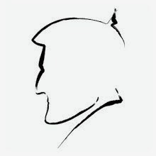
Illustration: Accountant at Work

I drew this little guy for a magazine column about a clueless accountant. I based his doodle-filled notebook on the one I'm currently resting my forearm upon.
Magazine Design: Molecular Manipulation


Magazine Design: February Cover

Magazine Design: Onboard Entertainment

I like the type treatment and design I used on this spread. Thought I'd throw it up on the blog here for future reference.
Tuesday, March 13, 2012
Magazine Design/Illustration: Boxers


 No art? No problem. That's what I tell my editor's these days. They presented me with this feature about who is really in charge on a yacht: the owner or the captain. I sketched up about six ideas, but was glad they went with this first one, as I am a big fan of boxers. And I think that shines through in my savagely cartoonish illustrations.
Monday, March 12, 2012
Magazine Design: Refit
 A surprising amount of path cutting to get this image to look right. But worth it. I like how "The Snowball Effect" sits behind all the scaffolding.
Subscribe to:
Comments (Atom)