
 The cover to Dockwalk's May issue
Monday, June 15, 2009
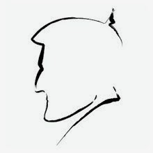
Magazine Design/Illustration: Paradise Lost


I was trying to come up with artwork on this feature about difficult guests when not only did an appropriate style hit me, but also a way cool title to tie it all together. Both myself and my editor's were quite pleased with the results.
Magazine Design: Xtreme Adventure
 This "Xtreme" feature presented the perfect opportunity to lay some type down, "Heroes" style. Those who have seen how the designers treat the titles at the beginning of each episode will know what I'm talking about.
Magazine Design/Illustration: Job Harder


 My magazine nominated this feature for a B to B Folio award in 2007. Lamentably, it didn't win. But still. Nominated is nice. I blame the intrusive use of the "real" photographs on the sidebar of the feature's second page. My editor insisted upon their usage, as the staff photographer went through hell to get them.
Magazine Design: Tender Gear Feature

This feature about gear that can be used aboard yacht tenders ended up coming out very fine.
Magazine Design: Color of the Sea


Magazine Design: Wine Column
 This was a design for the "Cheers" column that runs monthly in Dockwalk. I really like the quiet simplicity of it.

Magazine Design: Voting On the Best Yacht


 The above images are all from a spread I did for the other magazine I work for: Boat International USA. This feature was a monstrous 15 pages, so I'm only showing the first few pages here. I based the design of it on what I was seeing at the time in the media surrounding the "Obama/McCain" election coverage.
Magazine Design/Illustration: Sticker Shock


 I always enjoy the opportunity to illustrate. And this feature demanded it. So I created a fairly simple illustrative style and proceeded to crank out four pictures to accompany the assigned article. I liked my main character. She ended up looking like an evil Tina Fey. What more could I ask for?
Magazine Design: Pulp Feature

 I had no idea on what to do on this feature about charter agents. Then I found the picture of the stunning red head on a stock site and decided to go in a bit of a unique direction, turning the feature into something that harkened back to the days of the pulp novel. I ran the picture of the woman and another of a harried man through Photoshop and made them look posterized, resulting in an interesting composition that hopefully made the reader want to take a look at this extremely dry feature.
Magazine Design: Breaking In Boat Feature
 I'm not sure that everyone gets it right away, but the main text is in the shape of a champagne bottle. I thought that was a clever solution to the problem that arose when I realized I had a feature about yachts being broken in, but not a single usable photo of a champagne bottle breaking against a boat.
Magazine Feature: Gear Feature


This spread contains fond memories for me, as it was one of the first times that I was able to use graphic elements like icons, stroke styles and typography to save what would have otherwise been a sparse feature filled with sub-par, manufacturer-supplied pictures.
Magazine Design: Crews in the Caribbean

This was the opening page to the "Crews In the Caribbean" section. I came up with the verbiage for the title which umbrellas the five features together. It was the first time I had ever done anything like that and I thought it came out pretty well. Colorful, clean and evocative.
Magazine Design: Travel Feature
 This was a piece for the aforementioned "Crews In the Caribbean" feature. I've included only the opening spread here because, really, the other eight pages of the feature are just more of the same. I liked the triangle "rating" system I came up with, as well as the green gradient in the boxes.
Magazine Feature: Paranormal Passage
 I had to throw this one in as it is easily one of my favorite feature openers (it doesn't hurt that I love the subject matter - ghost stories – as well). I put the picture together from several different sources. The rusted background was one layer. The porthole was another. And of course, the creature was it's own layer as well. I spent much time taking an image that really wasn't very scary at all and upping the creep factor as much as was (in)humanly possible.
Magazine Feature: From the Future
 I was hesitant to put this page in, as it is really just the middle page from a larger feature, but the hologram idea was a pretty good one and the side bar looks quite nice. So why not?
Magazine Feature: Monaco Grand Prix
 Though I'm no huge fan of the sport, certainly the subject of racing conjures up many a solid graphic element to work with.
Magazine Design: Spa Feature

A rare chance to flip type on its side and have it come out halfway decent looking.
Thursday, June 11, 2009
Packaging Design: Ore Ida French Fries
 I enjoyed working on packaging design in the early days of my career. Here's some early work I did for Ore Ida.
Packaging Design: Lender's Bagels
 I started my career working for Lender's Bagels. Attached is some pics of their packaging.
Poster Illustration: Team Incredible
 I had just seen "The Incredibles" before illustrating this poster and was very inspired by the cut paper illustration technique they used on the ending credits.
Concert Poster Design: Maroon 5
 This poster came out pretty cool. I only had one picture to work from and their logo.
Poster Design: Chill Fest Penguin
 My first fully illustrated poster. At the time, this was my most successful venture with Adobe Illustrator.

Poster Design: Super
 Loved this one because I was actually alotted the time to do a proper illustration for my friends at SUNY Stony Brook.
Concert Poster Design: Vanessa Carlton
 Much success with typography on a poster that has almost no words.


T-Shirt Art: Battle of the Sexes

Here's some t-shirt artwork I did for the College of Southern Maryland's "Spring Fling" week.
Subscribe to:
Comments (Atom)