

Thursday, December 10, 2009
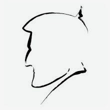
Illustration: Draft Pick

Here's an illustration I did for a column that talked about the idea of a draft taking place in the yachting community. The guy pictured here has just apparently been signed to the "National Yachting League" mentioned in the story. Good for him.
Magazine Design: Table of Contents


These are the redesigned Table of Contents pages from the user-generated issue of Dockwalk. I wanted them to be both colorful and minimal. I feel I succeeded in the endeavor.


Magazine Design/Illustration: Miracle Cure

I'm always happy to do an illustration for the section of Dockwalk called "Dishing It Up" because I get to use the chef character I created for it. Even if I did have to make her sick this time out. Don't blame me, though. It's the writer's fault for submitting a story about the chef being ill and having to watch as other filled in for her. Poorly.
Magazine Design: Dockwise Feature

The only reason this piece is here (it's the first page of a larger feature) is to remind me that, if properly motivated, a designer can always find a use for photos saved at 2x2". Such was the case here and I decided to just use the filmstrip idea to feature them all. Obviously, I had the one big picture to use, which was wonderful, because I needed something to anchor the text on top of.
Magazine Design/Illustration: Mr. Men Feature


This feature had a joke in it that was repeated numerous time. The general idea is that the owner was referred to as "Mr." Fill-in-the-Blank. So he was "Mr. Money Bags," "Mr. Shady Owner Man," "Mr. Seasick Owner-Who-Thinks-It's-Romantic-To-Do-Deliveries." It reminded me of the "Mr. Man and Little Miss" books I loved growing up. So I came up with a similar illustrative style in the hopes of reminding others of the same thing.
Magazine Design: Table Decorating

A nice piece on table setting that I did for the "Interior" section.
Magazine Design: Surf Column

In this travel section, the pickings were slim in the way of photography. But the show had to go on. So I did my best with the tiny, low res pictures I had. To my surprise, it came out pretty good. Nice and colorful.
Magazine Design: Wedding Feature


Here are a couple of pages from the first of the features I designed for our user-generated issue. The big innovation for me was the gel button at the top of all the pages that tells the reader what section they are in. All the photos were supplied by a stewardess who had just gotten married. Fortunately, both her and her husband were good looking and her pictures were of a high quality. Otherwise this feature could have been a disaster
Magazine Design: December Cover
 We have here the cover I did for the long-awaited "user generated" issue of Dockwalk. I wasn't a huge fan of the photo, but my Editor insisted, so what could I do? I think the typography's pretty effective. The interior of the magazine (which had to be redesigned for this issue) used color bars to inform the reader what section they were in. The colors used in the cover lines foreshadow that device.
Thursday, October 15, 2009
Illustration: Engineer Einstein
 There are a few figures in our world's history that just lend themselves to caricatures. Einstein is definitely one of them.
Magazine Design/Illustration: Silence of the Lobsters
 For those wondering... yes, I am a huge fan of "The Silence of the Lambs." So when I found an opportunity to marry it to this column, I went for it.
Illustration: Holiday Preparedness
 I drew this for a feature about Holiday Preparedness. In the end, I was more impressed with the illustration than the layout, which is why it appears here by itself.
Thursday, August 13, 2009
Illustration: Rambo
 What child of the 80's didn't love John Rambo? I don't know. I loved him so much that I leaped at this opportunity to do an illustration of him. I based it entirely on the poster for "First Blood: Part 2." It' s pretty accurate save for the little green necklace. I couldn't resist adding that, as I always thought that was a cool accessory of his in the movie.
Illustration: Evil Chipmunk
 Has there ever been a more evil looking chipmunk? I don't think so. I put this woodland monster together for a column. I like him.
Magazine Design/Illustration: The Messy Chef
 This illustration was done for our monthly column. This month's was about a chef having her kitchen destroyed by an owner who fancies himself her equal.
Magazine Design: Security Feature

 These two pages are from this month's feature on yacht security. I grabbed all sort of elements from many different sources. I drew the eye. The red lines which surround the iris were actually taken off of a vector globe. The circular object surrounding the eye was stolen from an extremely busy clip art background. And the texture in the background I made using an InDesign Stroke and a simple gradient.
Thursday, July 9, 2009
Magazine Design/Illustration: Asylum
 I decided to come up with a new character to run in this monthly column. Unfortunately, he had to be crazy for his first appearance. I look forward to seeing what I'll do with him next month.

Magazine Design: Jet Feature


I thought that this feature came out quite well. I'm especially fond of the opening spread. It's amazing what one can do with proper photography!
Magazine Design: Florida Yachting
 This is the opening spread for a nine page feature about the history of yachting in South Florida. I grew up in South Florida, so I just tapped into my own personal sense of nostalgia when putting this piece together.
Magazine Design: Mama Marina
 I don't like to start a feature off with a horizontal half picture. But the way I had it on this spread here, I feel like it balances pretty well.
Magazine Design/Illustration: Survival
 This is the fist page of the "Survival of the Fittest" feature. I had a ton of fun with this. The feature was all about how, to be viable, a crew member must be able to do more on board the boat than ever before. Otherwise they might loose their job to a more qualified competitor. Anyway, the very word "survival" immediately conjured up the works of Frank Frazetta. That and the poster for the first "Vacation" movie served as inspiration for the above illustration. I only wish that I had time to paint the piece and really amp it up with some chiaroscuro. Next time...
Magazine Design: June Cover
 Dockwalk's June cover. I like my dotted stroke element between cover lines.
Magazine Design: Acronyms Feature
 Color is back in this feature. Color and typography. Both of which were absolutely necessary to help make this piece on yacht classifications look like it was worth reading.
Magazine Design: Job Longevity Feature


 I had a lot of fun experimenting with a newer, simpler art style for this feature. My only regret? The rainbow pyramid at the bottom of the last page. An element which was forced upon me at my editor's insistence.


Monday, June 15, 2009

Magazine Design/Illustration: Paradise Lost


I was trying to come up with artwork on this feature about difficult guests when not only did an appropriate style hit me, but also a way cool title to tie it all together. Both myself and my editor's were quite pleased with the results.
Subscribe to:
Comments (Atom)